From Pixels to Paint: My Creative Journey
Welcome to From Pixels to Paint: My Creative Journey! Here, I’ll be sharing the stories behind my work in photography, videography, and graphic design. Whether it's capturing a moment, designing a visual identity, or exploring new creative ideas, I believe every project is a chance to tell a unique story. Join me as I dive into the process, share tips, and give you a peek into how I bring ideas to life through the lens and beyond.
- All
- Photography
- Design
- Education

Picture this: you’re scrolling through your favorite social platform, and a vibrant, candid photo stops you in your tracks. It’s not overly posed or generic; instead, it tells a story. That’s the magic of professional lifestyle photography—it connects, engages, and inspires. In an age where authenticity reigns supreme, the way you present yourself or your brand visually can make all the difference. Whether you’re an entrepreneur, a creative professional, or someone building a personal brand, high-quality lifestyle photography is an investment that pays dividends.

When it comes to branding, picking the right color palette isn’t just about choosing your favorite shades—it’s about understanding how colors can influence emotions, shape perceptions, and even drive customer actions. If you want your brand to stand out, leveraging color psychology is a powerful way to do it. Whether you're just starting out or giving your brand a fresh new look, here are a few tips to help you choose the perfect color palette.

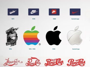
In the kaleidoscope of design history, logos have undergone a remarkable evolution, shifting alongside cultural trends, technological advancements, and the ever-changing tastes of consumers. Yet, throughout this journey, certain timeless principles have consistently guided successful logo design. Let’s explore how trends have transformed logos over the decades and uncover the enduring rules that ensure their impact remains strong.
© Copyright 2025 – Bre Redmond. All right Reserved
